ROAR Organic

Working with my team, I partnered with ROAR Organic to elevate their Canadian digital presence and drive sales. Together, we developed a comprehensive omni-channel marketing strategy, implementing targeted tactics to grow their social media following, expand their email subscriber base, and, most importantly, boost online sales.
portfolio

Packaging

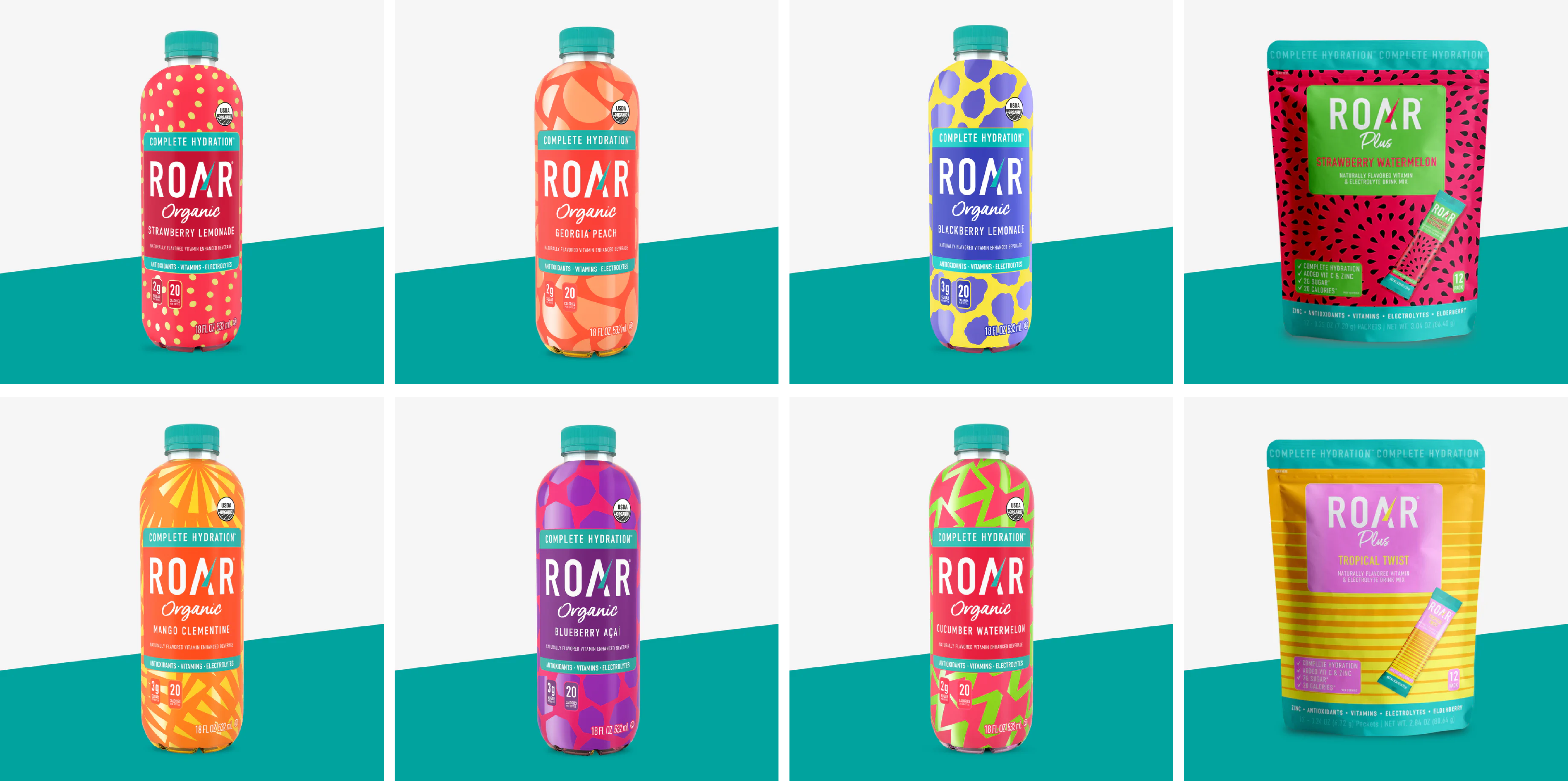
For the ROAR Organic packaging refresh, the goal was
to capture the brand’s bold energy and health-focused identity. The new design features vibrant colors, dynamic patterns, and clean typography that highlight ROAR’s natural ingredients and playful personality. Every element was crafted to enhance shelf presence and create a cohesive visual experience, helping the brand stand out in a competitive market while reinforcing its reputation as a refreshing, energizing beverage.

Project Overview

Development & Visual Strategy

For this project, I designed the packaging label for ROAR Organic’s Blueberry Açaí beverage, ensuring a visually engaging and functional design that aligned with the brand’s identity. The process involved conceptualizing the look and feel, refining the dieline for production, and creating photorealistic 3D renderings using Esko.

The goal was to create a bold, vibrant, and modern label that stood out on the shelf while maintaining ROAR Organic’s signature aesthetic.

I explored various pattern designs, typography choices, and color schemes to balance energy and clarity. The deep purple and magenta hues were selected to reflect the blueberry and açaí flavors, while bright green accents provided contrast and freshness.

Dieline Implementation

Once the design direction was finalized, I translated it into an accurate dieline, ensuring proper layout and alignment for shrink-sleeve application.

Key considerations included:

Safe Zones & Cut Lines – Making sure critical information, such as the logo, nutritional facts, and regulatory elements, stayed within safe areas.

Seam Alignment – Carefully positioning design elements to prevent distortion or misalignment during production.

Print Specifications – Factoring in color consistency and legibility across different lighting conditions and print finishes.

3D Rendering & Visualization

To bring the design to life before production, I used Esko Studio to create high-quality 3D renderings of the bottle.

This step allowed for:

Realistic Packaging Previews – Providing stakeholders with a near-final visual representation of the product.

Distortion Testing – Ensuring that the shrink-sleeve design would apply smoothly without warping key elements.

Marketing & Presentation Assets – Generating photorealistic images for e-commerce listings and promotional materials.
roardielineandrenderingspackaging

Crushing KPI's!

The impact of this overhaul has been transformative. ROAR's impressions have grown by 18,000%, resulting in nearly a million impressions per month. Engagements have surged by 47,000%, and they successfully gained over 7,000 new followers across their Instagram and TikTok platforms, experiencing a monthly growth rate of over 130%.
RoarSocial
Heavy on esko product mock ups and photoshop to create impactful social media content
a mock up of the new ROAR website

A Seamless Digital Experience

The ROAR Organic website was designed to capture the brand’s vibrant energy while delivering a seamless, user-friendly experience. The focus was on streamlining the customer journey, highlighting ROAR’s bold flavors and health benefits. I enhanced navigation for effortless product discovery, incorporated clear calls-to-action, and developed intuitive category pages to help users quickly find their perfect flavor. The result is a dynamic, visually engaging e-commerce platform that boosts interaction, simplifies shopping, and brings ROAR’s playful spirit to life online.